Title Block
The Title Block showcases the title at the very top of the page below the navigation. It can also have a subheading beneath a horizontal line break.

A block to add individual cards one by one, with or without an image.

Display useful links using visual media and an interactive hover event. Layout will center when there are less than 4 cards per row.
A hero background image with 3-5 link cards, with the option to add an icon or small image to the cards.

The Title Block showcases the title at the very top of the page below the navigation. It can also have a subheading beneath a horizontal line break.
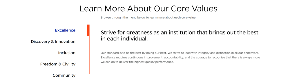
Inserts a set of tabs that allows users to navigate through different sections of content without leaving the current page.
Slider that displays cards with a manually entered image, title, description, and link destination.
Inserts a full-width section with a title, text, and up to 3 buttons.

A content block that has a header, detail text, a button, and a related image that has the option to appear on the left or right of the text content.

An orange pullout panel which, when opened, shows links to the current page’s subpages.

Manually enter an author name and contact info.

Displays post date, share buttons, and intro text.

Enter post content, with a footer that displays cards linking to related stories.

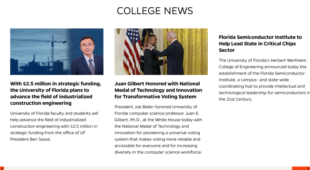
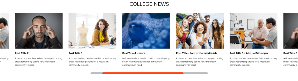
Slider that displays links to posts from selected categories with an option to display featured image and excerpt.
Displays a collection of images in a carousel format. Each image is represented by a thumbnail and can be clicked to view a larger version in a modal window. The gallery supports navigation using arrows or swipe gestures on mobile devices.

Insert a banner image, either half or full width, with title and description text and a link button.
Full width video or image with blue stripes background

A flexible block to use for free-form content within the default page template.

Display a gallery of YouTube videos (up to 3 per row).

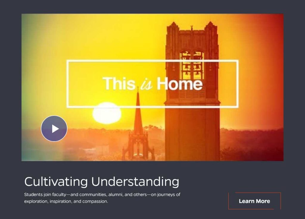
Full-width featured YouTube video with required title text and optional button and description.
A page/post header layout with featured image and two supporting images. Designed to link to news or other content.

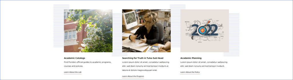
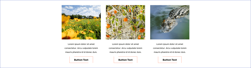
Group of two or three cards with image, title, description, and link. Each card is clickable.
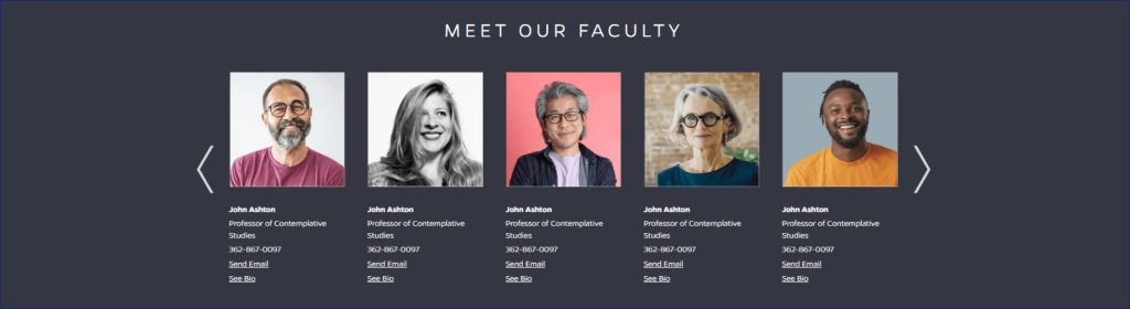
Presents a group of faculty or staff members in a summarized fashion, with an optional link to a fuller faculty bio on a separate page. Display entries in a single-row carousel format with horizontal navigation using arrows.
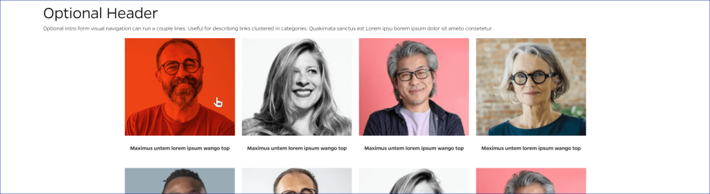
Presents a group of faculty or staff members in a summarized fashion, with an optional link to a fuller faculty bio on a separate page. Display unlimited rows of up to five entries each.

A quote made by or about a Faculty or Staff member.

A way to present a comprehensive overview of a faculty or staff member. The faculty bio block is integrated manually.

Highlight key facts or statistics on a page.

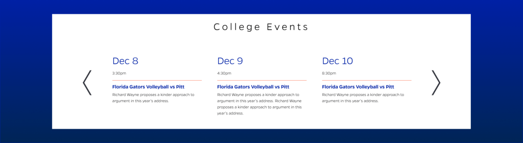
List of calendar events in a horizontal slider format.
Carousel that displays stacked images with a heading, description, and link button to the side.

Carousel slider that displays multiple slides with text content and background images.

Up to 3 cards with text inside an animated border.

Up to three horizontal cards with a top image, a central text area, and a bottom button.
Central text with right-aligned sidebars that can be link buttons.

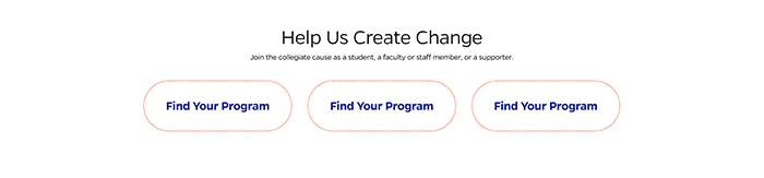
A showcase of styled call-to-cation buttons with title and description text, and subtext on the hover state.
Text and buttons showcase.

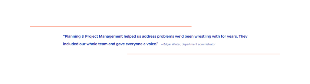
A UF-styled blockquote element.
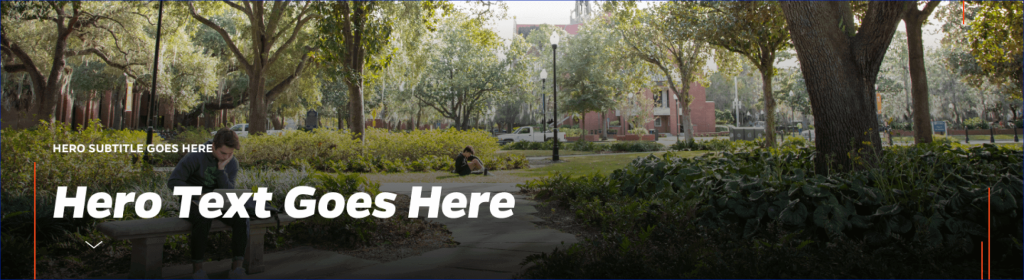
Displays an article title, with background hero image if desired.

Displays an announcement with the title on the left and an announcement and link button on the right.

Styled button with animation on focus.

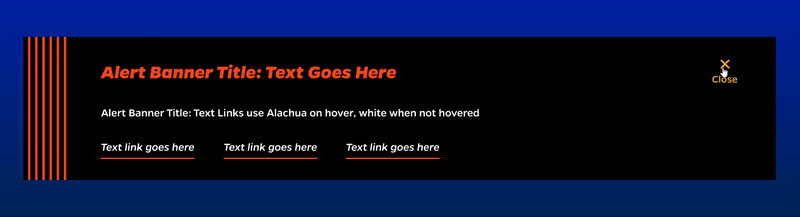
Displays emergency information at the top of the website.
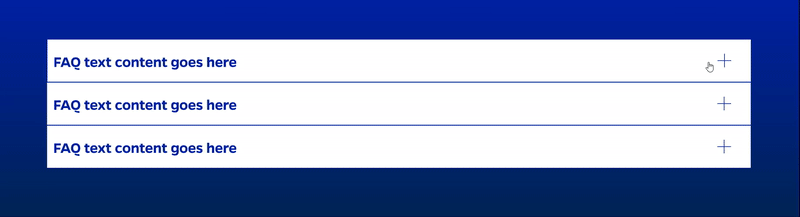
Toggleable content to use for FAQs and other expandable formats.