• If you’re running your own WordPress installation, the Mercury custom blocks require the Ufl-block and Section Navigation plugins. These plugins are included in the WordPress template download from the UF Brand Center.
  • NOTE: When editing, most block settings (and nested InnerBlocks) are more easily accessible from the Document Overview and Block Settings Inspector than the Content Area.
  • See the Mercury pattern library for in-page examples and suggestions of when to use.
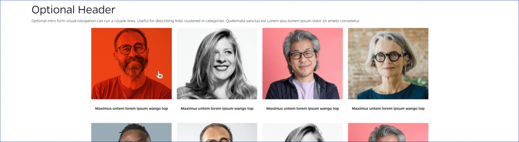
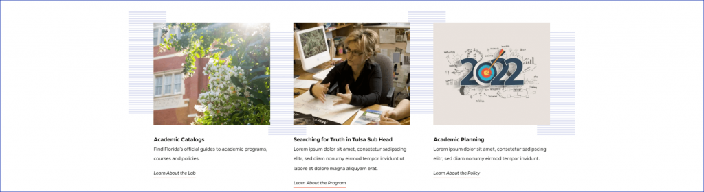
Categories

Card (ACF Block)

A block to add individual cards one by one, with or without an image.

ACF Card block in 33.3% width configuration

Visual Navigation

Display useful links using visual media and an interactive hover event. Layout will center when there are less than 4 cards per row.

Visual navigation

Title Tool Block

A hero background image with 3-5 link cards, with the option to add an icon or small image to the cards.

Title tool block example.

Title Block

The Title Block showcases the title at the very top of the page below the navigation. It can also have a subheading beneath a horizontal line break.

Mercury title block

Tab Block

Inserts a set of tabs that allows users to navigate through different sections of content without leaving the current page.

Mercury Tab block

Slider – Manual

Slider that displays cards with a manually entered image, title, description, and link destination.

Manual news slider block in Mercury

Showcase Text Only

Inserts a full-width section with a title, text, and up to 3 buttons.

Showcase Text Only block in Mercury

Showcase Text Image

A content block that has a header, detail text, a button, and a related image that has the option to appear on the left or right of the text content.

Showcase Text Image block in Mercury

Section Navigation

An orange pullout panel which, when opened, shows links to the current page’s subpages.

Section navigation block in Mercury

Post Footer

Manually enter an author name and contact info.

Post Footer block in Mercury

Post Intro

Displays post date, share buttons, and intro text.

Post Intro block in Mercury

Post Content With Related

Enter post content, with a footer that displays cards linking to related stories.

The Post Content with Related block in Mercury

Slider – News

Slider that displays links to posts from selected categories with an option to display featured image and excerpt.

Slider news block in Mercury

Image Gallery

Displays a collection of images in a carousel format. Each image is represented by a thumbnail and can be clicked to view a larger version in a modal window. The gallery supports navigation using arrows or swipe gestures on mobile devices.

Image gallery in Mercury

Hero

Insert a banner image, either half or full width, with title and description text and a link button.

Full width video / image

Full width video or image with blue stripes background

Fullwidth video block in Mercury

Full Width Text

A flexible block to use for free-form content within the default page template.

Full width text block in Mercury

Featured Video – Multiple

Display a gallery of YouTube videos (up to 3 per row).

Featured video - multiple block in Mercury

Featured Video

Full-width featured YouTube video with required title text and optional button and description.

Featured Video Mercury block

Featured Content Header (Featured Posts)

A page/post header layout with featured image and two supporting images. Designed to link to news or other content.

Featured Cards

Group of two or three cards with image, title, description, and link. Each card is clickable.

Featured Cards Mercury block

Faculty Listing Carousel

Presents a group of faculty or staff members in a summarized fashion, with an optional link to a fuller faculty bio on a separate page. Display entries in a single-row carousel format with horizontal navigation using arrows.

Faculty Carousel block in Mercury

Faculty Landing Block

Presents a group of faculty or staff members in a summarized fashion, with an optional link to a fuller faculty bio on a separate page. Display unlimited rows of up to five entries each.

Faculty Landing block in Mercury

Faculty Blockquote

A quote made by or about a Faculty or Staff member.

Faculty Bio Blockquote block in Mercury

Faculty Bio Block

A way to present a comprehensive overview of a faculty or staff member. The faculty bio block is integrated manually.

Faculty Bio block in Mercury

Factoids

Highlight key facts or statistics on a page.

The Factoid block in Mercury

Event Shell

List of calendar events in a horizontal slider format.

Mercury Event Shell block

Content Carousel – Stack

Carousel that displays stacked images with a heading, description, and link button to the side.

Content carousel - stacked Mercury block

Content Carousel

Carousel slider that displays multiple slides with text content and background images.

Mercury content carousel

Card (Text Only)

Up to 3 cards with text inside an animated border.

Example of the Cards - Text only block

Card (Text & Image)

Up to three horizontal cards with a top image, a central text area, and a bottom button.

Card text image cards

Cards Right Rail

Central text with right-aligned sidebars that can be link buttons.

Cards right rail mercury block

CTA Showcase

A showcase of styled call-to-cation buttons with title and description text, and subtext on the hover state.

Example of the CTA showcase block

Blue Centered CTA

Text and buttons showcase.

Blue centered call to action (CTA)

Blockquote

A UF-styled blockquote element.

Mercury styled blockquote

Post Header

Displays an article title, with background hero image if desired.

Example of a post header with image

Announcements Showcase

Displays an announcement with the title on the left and an announcement and link button on the right.

Example of Announcements block

Animated Border Button

Styled button with animation on focus.

Animated buttons

Alert Banner

Displays emergency information at the top of the website.

Alert banner

Accordion

Toggleable content to use for FAQs and other expandable formats.

Accordion